A new dashboard to help you monitor your business calls
MyOperator's new dashboard, enables you to view department and user wise call details, analyse the call traffic and check the business calls' performance.
We have released a new dashboard for your MyOperator account, enhancing its functionality. Though it was a long anticipation to launch this interface, we are glad that you will now be able to view a detailed, real time report of your business calls. With this new dashboard, you’ll be able to view department and user wise call details, analyse the call traffic and check the performance of your marketing / remarketing campaigns.[Tweet "@MyOperator launches a new dashboard to help you monitor your #BusinessCalls"]
New Dashboard - An Overview
The interface of the new dashboard is more intuitive and allows you to know what is happening with all your business calls. We have tried to achieve a user-friendly visual over your business call analytics.
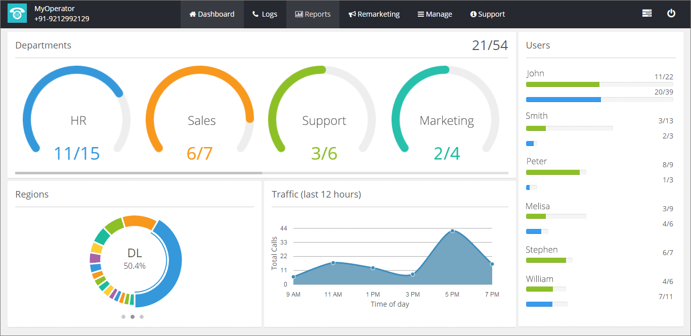
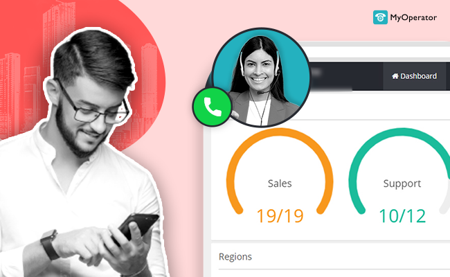
Department - wise Calls
The new dashboard offers you complete access to the details of the calls, managed by all the departments within your organization. Be it Sales, Support or Marketing, you now have an eye on how your calls are being treated and how well are they managed.

Callers, Region-wise Calls and Subscribers
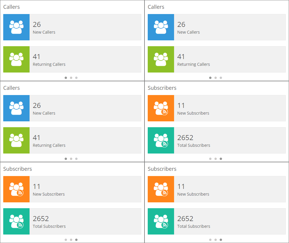
On the bottom-left side of the dashboard, you have the three sliders displaying:
- Regions: This section allows you to view the region-wise report of your calls. These calls are displayed in a doughnut chart, showcasing different colors for different regions. Thus, you get a comprehensive detail of your business calls from different regions. This chart helps you understand the behaviour of your customers and prospects.
- Callers: The section gives you data of 2 types - New Callers and Returning Callers. The “New Callers” bar gives you the number of new callers on your business number. The “Returning Callers” bar gives you the number of callers who have called you before.
- Subscribers: This section shows you data of your subscribers for your remarketing campaigns. “New Subscribers” shows you the new callers who have subscribed from your remarketing campaigns and “Total Subscribers”, and the total number of customers who have subscribed so far, respectively.
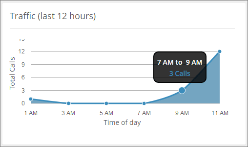
Call Traffic
The "Call Traffic" graph on the dashboard showcases the overall behaviour of the customer (business) calls at your organization in the last 12 hours. The x-axis defines the timings of the calls. The y-axis of the graph states the number of calls, both incoming and outgoing. This graph lets you understand your call traffic and its nature throughout the day.
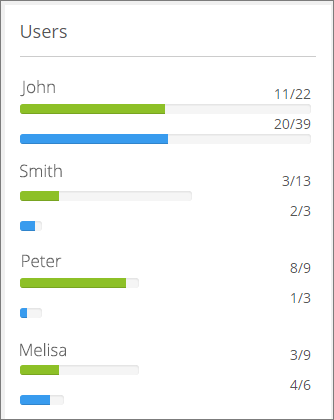
User - wise Calls
The “Users” section avails you user-wise data on the calls, both incoming and outgoing, and their attributes (missed, received or answered). Each pro user is displayed on the panel along with the details of calls attended by him / her. The user wise calls are segregated in Incoming and Outgoing calls in green and blue colors respectively.
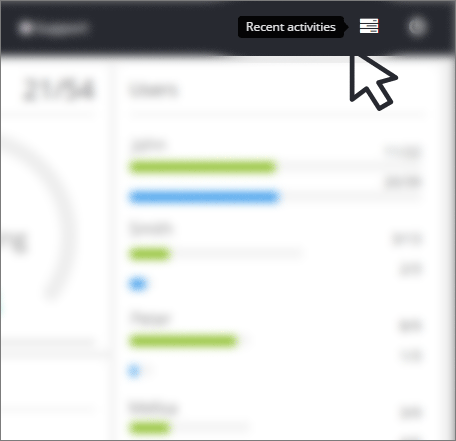
Recent activities
With the advanced changes UI changes in the new dashboard, we have shifted the “Recent activities” icon to the top-right on the dashboard. This icon summarizes overall activities taking place in your MyOperator account. For instance, who all have recently logged in or out of the account or whether there are any updates in terms of contact addition and extensions.
The new dashboard is a one stop place to know the performance of your business calls. It helps you analyze individual, department and overall performance of your organization.We're pretty excited about the new look and hope that it will make the whole process of managing calls easier and more enjoyable for you!Please let us know if you have any questions about the new dashboard.We will continue adding features to dashboard, but now go and test it!




.avif)

